Key details
Date
- 23 April 2026
Author
- Lisa Pierre
Read time
- 7 minutes
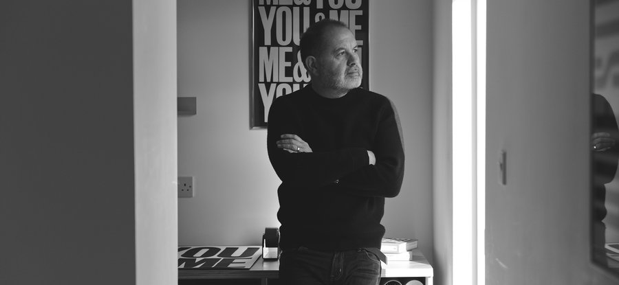
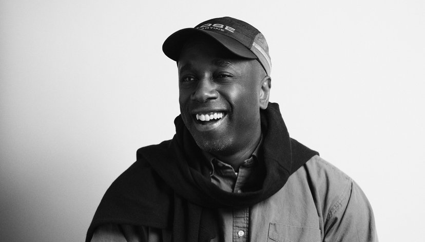
Anthony Burrill (MA Graphic Design & Art Direction, 1991) is a graphic artist renowned for his ability to distill ideas into simple yet striking forms. Combining analogue craft with bold, optimistic messages, his work communicates with clarity and impact.
Burrill frequently collaborates with forward-thinking practitioners across music, architecture, curation, education, and beyond, extending the possibilities of his chosen medium, letterpress printing, into new and ambitious directions.
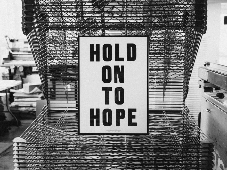
“As a creative influenced by the history of protest graphics, I’m aware of the significance of that visual language. I want to be part of that history, using that power not just to persuade, but to communicate ideas that matter and have a positive impact.”
Graphic Artist
At the heart of his practice lies a belief in the power of words, gentle humour, and straightforward communication. His distinctive style is shaped by an enduring passion for creativity without boundaries, a commitment to simplicity, and a natural curiosity about people and the world around him.
Burrill’s work is represented in the permanent collections of the V&A Museum and the Design Museum in London, the Cooper Hewitt Smithsonian Design Museum in New York, and has been exhibited internationally at institutions including the Royal Academy of Arts in London, the Walker Art Center in Minneapolis, the Triennale in Milan, and the Stedelijk Museum in Breda.
Your work is based around words and typography, and on things that have meaning and significance to you. What led you to build a creative practice around the sharing of these words?
I’ve been fascinated by words, letters, and typography since I was a child. At school, while most of my friends were busy playing football, I spent all my time in the art room. I had great teachers who encouraged me.
After a Foundation course I went on to study graphic design at Leeds Polytechnic, where the staff encouraged me to apply to the Royal College of Art. I graduated in 1991 and initially worked in publishing, advertising and television. As I matured and began to understand myself better, I was drawn to using words in my work, communicating through language and typography became my focus. Reflecting on the rich history of visual communication, typography, and messaging, I realised I wanted to contribute to that tradition.
When I left London and moved to East Sussex, I discovered a letterpress workshop called Adams of Rye. I began working with them and developed a strong working relationship. Alan Kitching, my tutor at the College, was also a major influence, and his use of type and language was a constant inspiration.
Over time, I took on less client work and focused more on my own projects. That’s how I developed my practice as an artist, working across graphic design, typography, and writing and that’s where I am today.
Anthony Burrill - Adams of Rye - Photo by Jane Stockade ©
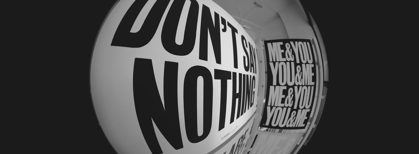
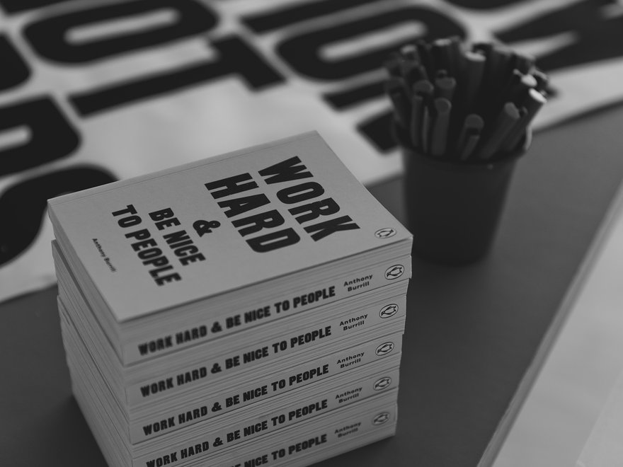
Work Hard & Be Nice to People is one of your most iconic pieces. Is it true you got this idea from someone at a supermarket checkout?
Yes, it is. It was just before I moved out of London. I was in Sainsbury’s on Clapham High Street doing some shopping and was queuing at the checkout when the woman in front of me said to the cashier, “The secret to a happy life is to work hard and be nice to people.” The phrase stuck with me.
About a year later, when I found the letterpress printers in Rye, I asked them to make a poster using that phrase. The only direction I gave was to make the words “WORK HARD” larger than the rest and to set the type centrally. They printed it, and it was beautiful. Initially I sent it out to friends, then continued to print it and sell it through galleries, until it eventually became my most recognised piece of work.
Are there any phrases or statements that have stuck with you that have yet to make it into production?
I think every print I make draws on something significant that has stayed with me. It’s often simple phrases like “just get on with it” or “just get it done” — the kind that come to mind when I’m procrastinating. Those are the thoughts that tend to loop in my head.
I’m naturally quite a positive person, and as a creative, you have to keep pushing forward, you can’t ever stop. You’re always telling yourself to keep going, to make the next thing. You never quite reach a point where you feel you’ve achieved everything. So in my head, it’s a constant refrain: “just get on with it,” “just make it,” “just do something.” Maybe that should be my next piece.
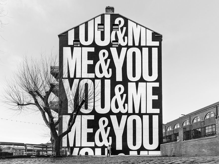
Anthony Burrill - Leeds mural - Photo by Chris Spencer-Payne ©
You’ve collaborated on so many different projects, from murals to exhibitions and prints. What do you get as a designer from working with other creatives?
Everything I do is collaborative in some way. I love that interaction with people, we’re all so interconnected. It’s about those connections, being in different places, and drawing inspiration from a range of sources.
I find a lot of inspiration just by being in someone else’s workspace, absorbing their story, their process, and their references. That’s how we work as creatives: we take in all these influences, then bring them together in our own way to make something new.
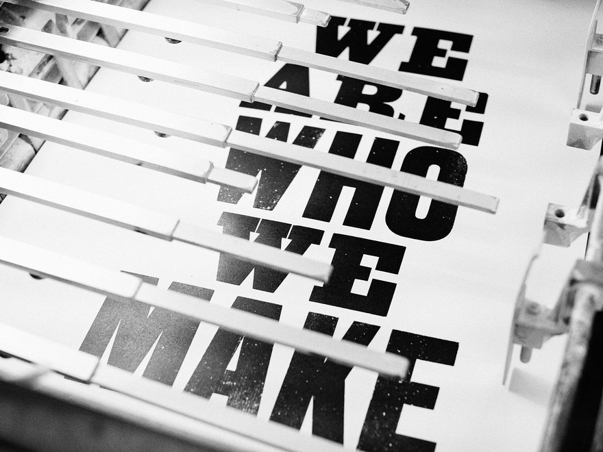
You use a letterpress in a lot of your work. Do you think traditional crafts like it will survive?
Yes, I think so. There’s been a real resurgence in letterpress over the past decade. I run many workshops where people want to make things by hand and understand the process, seeing how something is physically made.
Slowing down and spending an entire day setting just a few words takes you to a different place. It’s a contrast to instant digital communication. Working with analogue techniques encourages a slower pace and allows you to think about your ideas in a different way.
So much of history is written in print. Does it resonate with you that when you are creating something, you are adding to history?
I think so and I hope so. When you think about phrases like “Votes for Women,” the suffragette movement, and the power of language, it’s clear how words can define an era. The same is true of the civil rights movement, or John and Yoko’s “War Is Over” poster. These are all messages that captured a moment in history.
I’m drawn to putting positive messages out into the world, and in the climate we’re living in now, that feels especially important. Work that carries meaning can also grow in significance over time.
Anthony Burrill - Warchild -Photo by Owen Tozer ©
“Everything I do is collaborative in some way. I love that interaction with people, we’re all so interconnected. It’s about those connections, being in different places, and drawing inspiration from a range of sources.”
Graphic Artist
Did you find any difficulties in translating your work into book form?
It’s different moving from a poster — a single, concise message — to something like a book. With a book, you have more time with the reader to expand on ideas, and you use words in a different way, tailoring the message to a longer form.
When you were at the RCA you were taught by typographer and graphic designer Margaret Calvert. Did her work influence you?
Margaret interviewed me, though at the time I didn’t fully realise who she was or the significance of her work. Margaret and the other tutors challenged me in the best way, encouraging me to question who I was and what sort of work I wanted to make.
I’d been really encouraged at Leeds Polytechnic, so I assumed the Royal College would be similar, but it turned out to be completely different. It took me the full two years of the MA course to work out what I wanted to do. I was in a new and unfamiliar environment, learning in a different way. The MA laid the foundations for what I did once I graduated.
A highlight of my time at the RCA was a short course in the audio visual department with tutor Lol Sargent. I made a short film called Anna Loves Horses, using type, images, and a spliced soundtrack. It was quite experimental, and it was noticed by Peter Dougherty, then creative director of MTV Europe. He gave me my first job after graduating and helped start my career.
Anthony Burrill - No safe place - Photo by Tom Sharman ©
Your work often serves as a form of communication with positive messaging. Was this a conscious choice?
Yes, definitely. Given my background, I’ve always been interested in protest and in having a clear point of view. During my foundation course, I joined Greenpeace and bought a sweatshirt with the logo on it. Wearing it gave me a sense of identity and connection.
Protest graphics highlight the power of words. It’s not a silent protest, but a visual one. It’s about putting ideas out into the world, however they’re shared, they become part of people’s lives, a kind of rallying cry, something to gather around.
Do you feel design has the power to influence, and how much power does this give creatives like yourself?
Yes, I do think design has the power to influence, probably more than people sometimes realise.
Everything is communicated visually, whether in advertising or social media. We are constantly surrounded by visual messages and being influenced by them. It’s central to the way we communicate.
That gives design real power. It shapes perception, directs attention, and helps set the tone for how ideas are understood. Because of that, I try to use it in a positive way. I work with charities like War Child, and campaign groups such as Music Declares Emergency, and it feels meaningful to contribute to those causes through design.
As a creative influenced by the history of protest graphics, I’m aware of the significance of that visual language. I want to be part of that history, using that power not just to persuade, but to communicate ideas that matter and have a positive impact.
Anthony Burrill - Photo by Dunja Opalko ©